Case study: Experience Transformation
Complete redesign of underperforming sales funnel that targets small businesses purchasing healthcare benefits.

A case study highlighting the major issues addressed through research and redesign improved the traffic through this sales funnel.
Challenges
- The insurance company’s needs felt more important than the customer’s: The flow required users to surrender a lot of information and possibly consult their accountant before seeing any plans.
- Most customers employ less than 10 people: Customers juggle roles within a small company. They often lack the specific understanding of insurance that a dedicated HR person would have.
- Informal processes: Small business employers often know their employees’ health concerns and do a lot of decision making via word-of-mouth. They see no advantage in migrating to an online process
- Out-dated expectations: The full ramifications of the ACA are not widely understood and people come into purchasing benefits with outdated ideas. When they are only asked to enter employees’ ages (rather than gender, pre-existing conditions, etc.) they stop and don’t trust their online quote.

Solutions executed
- Put the company’s needs into context. Move specific information requests into the exact spot they are needed instead of demanding all information upfront. Make it easier for users to find what we want them to find.
- Give the people what they want. Allow users to see plans and tentative pricing within the first couple clicks with the option to then enter more information for an accurate quote.
- Add flexibility. Improve exploration. Add methods for comparison shopping. Make it easier to adjust plans pricing and set a budget. Make it easier for users to share what they find with others.
- Simplify. Clarify. Condense marketing at the front end of the funnel. Match consumer expectations by adopting a shopping cart metaphor. Humanize the language and remove jargon. Add in-context definitions. Address out-dated assumptions about pricing.

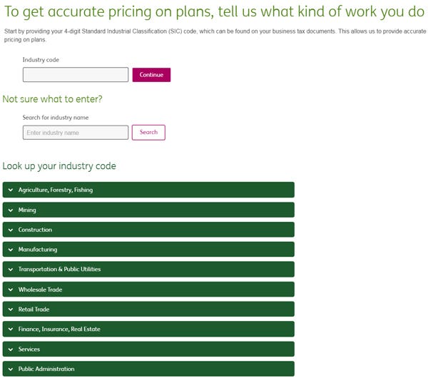
Improvement highlight: Standard Industry Classification Code
Standard industry classification (SIC) lookup was a required field before users could see any plans. Most business owners do not know their SIC code and would have to ask their accountant.
How hard can one field be and why did I insist on replacing it with a whole page?

- This is too much work for one field with a look-up function to do. There are hundreds of SIC codes and sifting through them in a single lookup field was an exercise in guesswork and frustration akin to reading an encyclopedia through a keyhole.
- SIC codes sometimes make no sense in normal language. E.g. a restaurant is listed as an “eating place.” Giving users a means to narrow down their particular industry within the context of the whole list turned what was a game-stopping required field into a process that took less than one minute and was easy to use.
- The label didn’t say exactly what was supposed to be entered in that field. No one understood what to enter or why their entry was being rejected.
New look-up page for Standard Industry Classification
Close full-screen prototype window before proceeding to mobile view.
Improvement highlight: Plan Selection
Plan selection and moving between benefits relied upon a dialog box that users had difficulty finding.
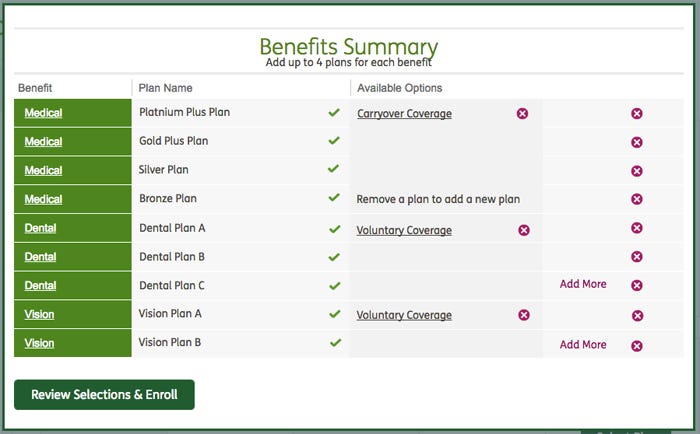
No one quite knew what they were looking at. Users would select a plan and then be faced with this dialog box. It was not easy to spot the plan one has just selected in the list.
No one knew what to do next. It was unclear whether or not the next step was to Review selections. How does one keep shopping for plans? Navigation to Dental or Vision was not clear.
Columns for available options made no sense. No users understood what these were. It’s clear how to add or remove them…but what are they?
New Shopping cart page
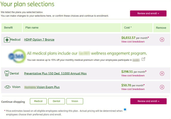
Close full-screen prototype window before proceeding to mobile view.
Creating a shopping cart page for selected plans matched with the mental model users bring to any online shopping experience. Users found it much easier to go back and forth between this page of current selections and the pages where they could keep shopping for plans.