Case study: notifications
Simplifying work-to-be-done by adding effective notifications
--

Users of an outpatient care management software need to be notified when a patient assigned to them, goes into the hospital or is discharged from inpatient. The system delivered these notifications as new tasks in the user’s task list.
Users could not get an accurate picture of work-to-be-done.
When I conducted in-person user research this quickly came up as a pain point. I started the interviews by asking users to show me how they started their work for the day. They consistently described going to their task list and, before they could review new work, they had to “get rid of all the fake tasks”. They had to spend time each day deleting tasks that were actually notifications.
The main goal is to improve workflow and only show users what they need when they need it
“The task list should just be work I need to do”
I set out to make the task list work better for users by pulling these notifications out of that list and displaying them in another, less obtrusive, location. I had experience with successfully adding on-screen notifications in a previous job and had a hunch that similar treatment would work in this situation as well. But first I needed to make sure I understood the problem from all sides and test the hypothesis with users.
Pinpointing the genesis of the problem
Discussing the user feedback with the development teams, I wanted to know the reasoning behind why notifications were added as tasks in the first place. I especially wanted to verify whether or not this had been put in place because of a framework limitation.
The developers had, prior to my arrival on the team, operated without any design direction other than “do what’s easiest for you to execute”. They had added patient notifications as an extra task type because it seemed like a place where that could fit, users were already looking at the task list, and it was easiest to code. From their point of view, this design decision made perfect sense. They did not have the tools or the time to evaluate how this would impact people’s workflow.
During this discussion, I went into detail about the amount of time people spent getting notifications out of their tasks and the level of irritation it caused. Presenting this feedback the developers could empathize with the end user’s plight were willing to work with me toward a solution.
Adding something entirely new to the UI to deliver notifications
Developers were skeptical about adding the new method of showing notifications I had sketched out. Luckily, they were in the process of graduating the product to a new Angular framework. A new notifications widget provided a great opportunity to be the first usage of Angular within the current UI.
With green lights all around, I started to fully ideate and prototype a new design.
Execute a solution
“Not another bubble with a number in it!”

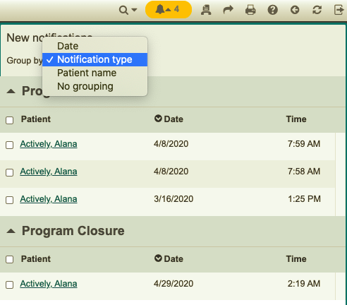
I began prototyping methods of adding a notification indicator to the top bar of the user interface. The indicator changed color and displayed a badge with the number of notifications if one had arrived. Clicking on the badge dropped down a list of new notifications.

The people who use this product tend to be late-career so I was sensitive to complaints about the type being too small and how excess hovering and mousing back and forth causes wrist pain. I set up the notification list to show/hide on click rather than on hover to relieve the stress of reading the list while consciously holding one’s hand still. I wanted the indicator to fade into the background if there were no notifications so the widget only became yellow when there was something the user needed to attend to. This prevented the need to mouse over to the notifications unnecessarily and improved legibility.
I had gotten feedback from our sales and customer services teams that users didn’t want another “colored bubble with a number” on screen. I understood that the overuse of badges as a UI device causes fatigue. But, this particular outpatient care management product currently employed no such “bubbles with numbers”. I felt this was an effective and right use of badges within the interface.
And besides, it worked.
Getting customer feedback
“How soon can we have this?”
I set up remote user tests via WebEx that allowed users to interact directly with the prototype and give feedback. 15 users from a range of health services clients participated in reviewing the prototype.
They loved it. Over and over again I was asked “When is this coming? How soon can I have this?”

I observed as testers successfully noticed and interacted with the indicator in the upper right of the screen. When I asked what they thought “this bell icon” meant they universally answered, “it’s a notification of some kind”. Often testers gravitated to this part of the prototype without any prompting from me and intuitively began to interact with the notifications.
With a very successful set of user tests completed, I worked with a development team to execute the design. One minor change had to be made to the visual presentation. But overall the execution adhered to the prototyped interaction and usability style guide.
Successful adoption, even by the skeptical
Thank you, thank you, thank you!
The new notifications indicator was released in early 2020. Often new features are not adopted because our customers are skeptical and don’t want their employees’ workflow upended by a UI change. This feature was an exception. Customers readily adopted it and have provided positive feedback.
Overall feedback has been this has been a positive addition to the UI that allows users to make better usage of their task list and saves them time when planning out their day.
**Note: in agreement with legal department, specific company and product names have been withheld from this article.