Case Study: Online enrollment for benefits
Heuristic evaluation and redesign of online enrollment flow.
--
Poor indicators on an enrollment page caused many customers to fail to set up benefits. Customer support had to constantly monitor the enrollment process in order to make sure businesses were signing up in a timely way.
At this step in the user’s insurance purchase process, the small business employer has entered into a contract with the insurance company. This tool allowed them to enter their employees' information so that employees could then go online and select what plans they would like for themselves and their dependents.
Challenges
Employees were not signing up for benefits. Support teams at Humana would realize that a customer had set up enrollment but that no employees were selecting benefits. Support teams had to contact customers individually and clarify what steps needed to be taken.
Employees would go through enrollment steps and not submit their benefits selections at the end. Support teams at Humana had to reach out individually to customers that had entered into agreement but had not submitted enrollment information.
Employees were missing the open enrollment period set up by the employer. Employers did not realize that they had to notify their employees of open enrollment. The support team frequently had to re-open the enrollment period for employees that had missed it.
Phase 1: Moderated user testing of the current page

First I decided to do a moderated user test on the current enrollment page. What was working that did not need fixing? What are the users' own words about UI elements that posed a struggle?
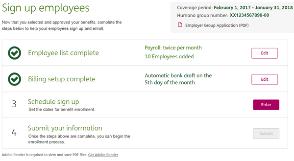
The page language seemed to state that this would enroll all employees in benefits and there was no need for the employee to do any work on their own. Thus users did not notify their employees of open enrollment.
Grey checkmarks on incomplete steps and the “Edit” action buttons gave the impression all work had been done already. So many users simply assumed they were finished and did nothing.
In addition, this looks like 4 steps when it is, in fact, five. Thus many users did not see the final submit button.
Phase 2: Heuristic Evaluation of current page.

Performed heuristic evaluation of current layout evaluating how page functionality violated or met user-centered principles.
Outlined solutions and prioritized each.
Phase 3: Redesign and re-test.

I created two design solutions as high-fidelity prototypes in Axure. One design kept the same page structure but addressed the usability issues. The other proposed a complete redesign of the enrollment page. Each of these was then put through moderated user testing. Users preferred both designs equally. We went with the solution that involved less of a design overhaul because of a tight timeline for development.
Final redesign recap
View full screen prototype
View mobile screen prototype
Close full-screen prototype window before proceeding to mobile view.
Grey checks on incomplete steps changed to numbers
“Edit” call to action buttons were changed to say “Enter/Edit” depending upon whether or not the step had been completed
“Enroll” language was removed to mitigate confusion.
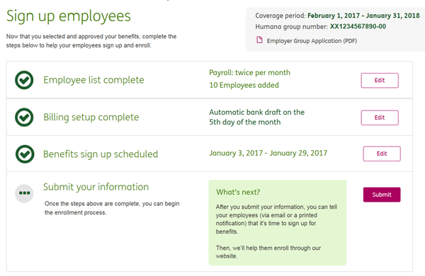
It was decided that the notification step was, in fact, not actually a step. The notification was moved to an interstitial page that appears after the final submit.
Submit step was made into the fourth step which is only enabled once other steps have been completed. When submit is available, instructions appear which emphasize that the employer must notify their employees
Hierarchy on this and any dependent pages (Employee list, Set up billing) set up to clarify functionality.
After the implementation of these changes, customer support noticed an improvement in enrollment and felt less of a need to police customers’ enrollment.