Innotas Redesign & Style Guide
Task and time tracking software primarily used by the legal industry faced an outdated and complicated interface badly in need of modernization.
--
Challenges
It was time.
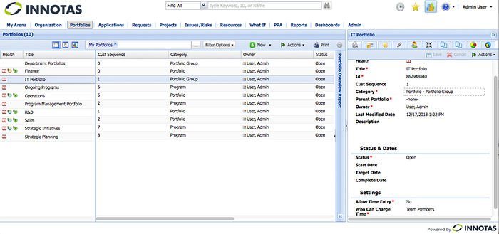
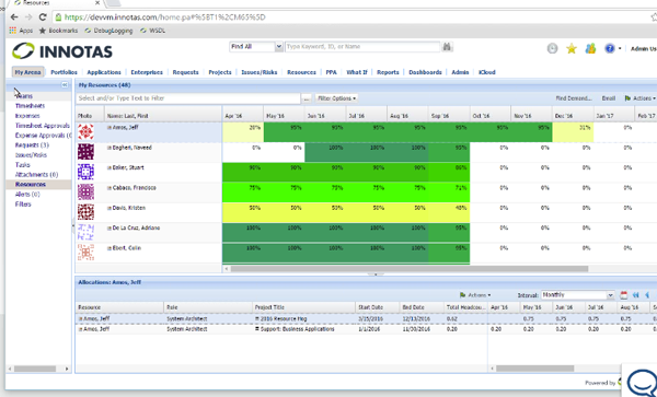
This product was getting a usability and functionality update but the visuals were not being addressed. The developers employed an OOTB Sencha style and icons from the “fam fam fam” library. The team had a product manager with a solid usability background, but no visual designer to rely upon.
It’s a complicated product.
This UI has to present a lot of intertwined functionality. But the pages had no clear hierarchy. The content was getting buried under the weight of the visuals. Excess icons made the page look like a Christmas tree. Users complained that the look was old, gaudy, and hard to read.
Original Design


Solutions
Simplify.
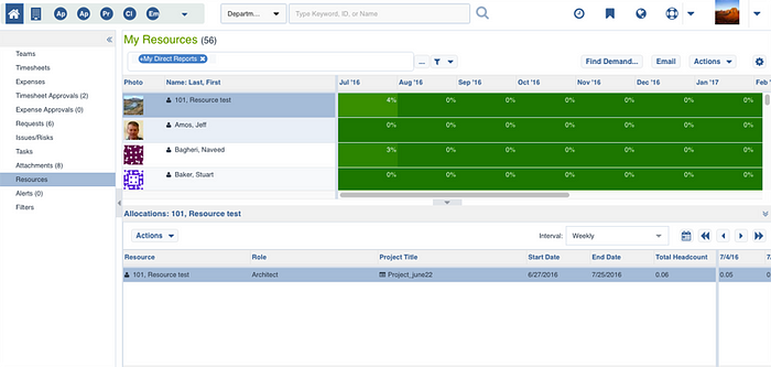
I worked with the lead front end developer and product manager to work out a simpler, quieter color scheme and a “flat” design treatment. Our goal was to reduce visual noise, clarify page hierarchy, and improve legibility. Background colors and borders were removed wherever they failed to clarify functionality and hierarchy.
Undecorate.
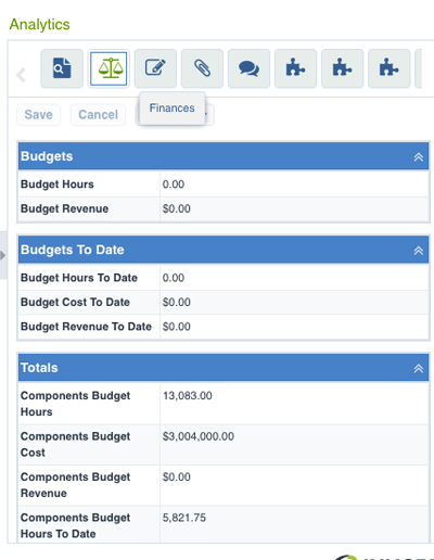
I worked closely with the product manager to go over every graphic element. We identified icons whose job would be better done by text and removed them. The Font Awesome icon library was employed so icons would blend better with text and be scalable.
Decide what’s really important
Content! The company logo moved to the bottom of the page to free up space for navigation. Row of tabs at top of screen turned into compact upper left navigation. Graphic elements were simplified or removed wherever possible. Font size was increased to improve readability.
New Design


**Note: Screenshots are taken from fake data on test server. Product is live and I have permission to use these images