Learning Management System Redesign
Transforming the look & feel of a visually overpowering interface.
--
Before:

UI was redesigned based on new branding colors in the summer of 2011. The previous designer had included 2 of the 3 new brand colors into the UI (teal & green). Prevalence of bright green was referred to as “Being kicked in the eyes” by users and made the product incomprehensible for anyone who is colorblind. In addition, the interface did not scale to fill the browser window and many on-screen elements had a fixed width. After conducting user testing and presenting a chorus of complaints about the coloring of the interface, I was allowed to redesign the look and feel.
After:

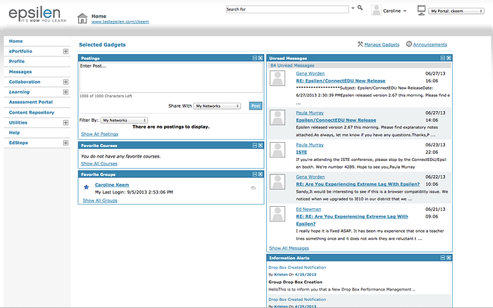
I worked with the front end developer to update the CSS. First, I removed most references to background images, replacing them with hex #s instead. I removed icons and borders that were being used as page decoration and not advancing the comprehension of material. I simplified the palette and increased white space. Overall contrast and visual comprehension of the hierarchy improved.
Over time additional measures were been taken to clarify the functionality in the header and to permit the interface to be scaled to fill the width of the browser window. Gadgets have been added to the home screen allowing users to directly access their most important content (courses) rather than having to go 2 clicks deep to find it.