Rebuilding an outpatient care coordination tool
Care coordination is a notoriously fragmented experience. I employed user-centered design principles to assist in creating an outpatient care coordination tool integrated with an EHR that has saved 30% hospital readmissions.
--

Health systems traditionally rely on expensive point-to-point interfaces to share information. More care teams from a more diverse set of disciplines spanning multiple points of care raise the cost of care coordination exponentially. Aligning these various providers is important both for controlling costs and ensuring consistent patient care.
We set out to create a new outpatient care coordination product to enable health systems to scale care coordination across multiple dimensions: care settings, payment models, and care models.
We wanted it to be a single platform solution based on proven usability design principles. This meant shifting the mission focus away from tools and technology and onto the needs and goals of the end-user.
These “Design principles” are simply core principles for harmonious living:
1. Don’t just do something. Sit there.
2. Don’t fix things. Empower people.
3. Play nice with others.
4. Stay teachable.
Don’t just do something. Sit there.
Until we spend time observing the real problem, any action toward a solution is a futile exercise. We risk wasting time creating a solution aimed in the wrong direction and which can harm, rather than help, our users’ productivity.
When I joined the product team in 2018 I was immediately introduced to a nascent project which intended to integrate a current product with an EHR. To meet its goal of holistic care coordination, it would house part of the toolset from our existing outpatient care coordination product within the EHR. As part of this, we would take advantage of new technology to improve usability.
I called for a pause. We first needed to gain an understanding of our users’ real work to ensure that a new toolset would support their process and create true benefit. We would only improve usability if we truly understood usage.
We had to move away from creating solutions only by listening to the words of users in online support forums. A good doctor, when faced with a patient who demands a specific treatment based on the wisdom of Dr. Google would never simply hand over a prescription. Why do we practice that kind of bad medicine on our software? If we treat a user’s stated symptom with a superficial fix but do not interrogate the matter properly, a lot of time, effort, and money goes into executing the wrong solution. The user pain point will move, not go away.
To observe users’ workflow within the existing outpatient care coordination software, I visited 3 customer locations, shadowed 19 users, recorded their experiences, and probed the process breakdowns I witnessed.
Pronounced themes quickly emerged from the data:
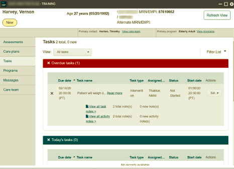
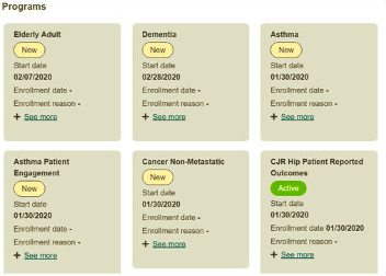
Lots of paper notes were being used to manage patient information. For example, I observed a user with an EHR on one monitor and our current outpatient care coordination tool open on another. She transferred the information needed to do a patient call from both of these onto a steno pad in front of her. She worked from that steno pad while talking to a patient on the phone and transcribed information written during the call back into the computer afterward. Many users performed similar activities on printed out face sheets or post-it notes.
The current product didn’t present patient information in a manner that matched users’ mental models. As one user put it: “The issue with this system isn’t just that there’s a lot of in and out and clicking around, but also that it doesn’t think like a nurse thinks. It’s not set up to address actual care as much as data management.”

I saw that we needed to show patients as a whole person not as a set of discreet tasks-to-be-done. Poor layout and lack of affordances often left users struggling to understand where they were, what was happening, and whether the system had recorded their work accurately. The solution had to simplify the screen and ameliorate many legibility problems.
Don’t fix things. Empower people.
My team does not need more reading homework. They need something easily consumable, that will take work off of their plates, and empower them to make their own informed design decisions.
Internalizing my observations, I didn’t want to just rebuild the interfaces of our existing tool within the new one. I focused on creating a kit of UI tools designed for doing effective patient information management. My ultimate goal is to see a single platform solution with a consistent user experience that is built upon this vocabulary.
The designers on other product teams provided a graphics library that established the company’s visual design standards. I transformed this into a kit of parts by expanding on the visual language and adding the UI elements needed for the care coordination environment. These interworking parts were collected and presented in a usability style guide.
A usability style guide walks through all possible interaction devices (e.g. form inputs, accordion controls, buttons). It gives the reader both a broad sense of how each device should be experienced as well as precise directions regarding functionality, accessibility, and layout. The guide is a complete design toolset. With this guide, a developer working on a feature at 1:30 pm in Bangalore who has a question need not wait for morning in Chicago to get an answer. It’s a stand-in usability consultant that empowers everyone to make effective design decisions.
Play nice with others
I like to say “We’re making a cake together. In this cake user experience design is not the frosting. It’s the recipe.” For this reason, I prioritize early and effective integration with my team.
Like most of the jobs I’ve taken since 2005, I joined this team as the first designer on a development-centered product team. My first manager held a product team summit to discuss how to integrate UX into their existing methods, what I as a UX designer have to offer, and how to best integrate design into their workflow.
The agile team building the new product consisted of front and back end developers working under the head of development. Integrating user-centered design thinking into a team has its surmountable challenges. But it’s exciting to watch others learn to pause and consider the user where previously they had not.
As I developed the style system, I worked with the lead developer to learn what he needed from me to put the usability guide to the easiest use. He stated that to be really helpful, it should include variables, utility classes, and design specifications that could be easily copied into a CSS or SASS file. I familiarized myself with Bootstrap 4, learned SASS, and rewrote the guide to provide design specifications that developers could copy as needed into their work.
I told the team that this guide was a living document that we would expand upon and modify. I prompted them to ask questions and poke holes in design elements they felt could be executed in a different way. This is the sort of feedback that developers often want to provide, but they’ve learned to fear being stonewalled by a defensive designer anxious to protect their intellectual fiefdom. Nonsense. I want all the ideas — even the bad ones (especially the bad ones).
I asked a team of developers to put on design hats. My hope was that everyone might see that usability was not a separate consideration but part of their work. And not just any part — the fun part! Having this level of involvement in its creation rocketed the adoption rate of the usability guide by developers into a new dimension.
Stay teachable
When I think I know what the user will like or get attached to my own “design solution”, I’m in danger. There is great value pausing to conduct user testing in order to stay present, teachable, and attentive.
Because this was a new release, we were not able to test with customers. Preliminary tests with stakeholders were well received. But stakeholders are not end-users. I found other ways to test the design.
In parallel with the development of this new toolset, I began conducting remote user testing of existing care coordination tools with our current customers. Our users had an opportunity to view upcoming designs and provide their feedback. I integrated the style and content structure of the new product into some of the prototypes that were being tested to get reactions from our users. The feedback was positive, and I was able to tweak some of the interaction models (e.g. for expanding and collapsing sections of content) to be more intuitive before they were released.
Developers were invited to watch remote user testing sessions. Initially, this baffled them. They couldn’t fathom why they should be involved in testing. After watching just a couple of tests, however, they were excited by hearing the real words of users and could understand product usage and user concerns in a way that 1,000 PowerPoint presentations from me would never inculcate. Better yet, it made them excited.
A user-centered design process focused our efforts and yielded effective results for our customers
Good design is like a spoon. When most effective it goes unnoticed but for the information it delivers.
Upon release in 2019, our new outpatient tool provided immediate support for collaborative care coordination. 30% of existing customers are rapidly adopting this integrative solution. These customers have reduced utilization by 40%, increased active program participation, and improved patient experience.
It has been positively received by physicians, ambulatory care coordinators, and inpatient care managers. As one data integration specialist stated: “This is a game-changer. My team can effectively collaborate now between inpatient and outpatient settings.”
This design effort represents the first step in our overall process of uplifting the experience of all users of our previously existing tools by continuing to focus on users first and making user-centered design thinking the activity of the whole team, not just that of one designer.
*Note: in agreement with legal department, specific company and product names have been withheld in this article.